
Role: Visual Designer
Teammates: Laurel Wiebe (Copywriter), Camila Lachman (Motion Designer), Danica Conneely (Creative Director), Jamily Knight (VP of Brand & Creative)
Brand revamp:
Metromile
A major part of the brand revamp was developing a comprehensive library of pixel-perfect brand assets. My role was to create and customize illustrations, icons, stock photography and logos. I also kept them neatly organized and up-to-date on the server.
Revised logo
Why Redraft the Logo?
My rebranding effort started with redesigning the logo. The old one had a few issues: varying thickness of the stroke, broken curves, inconsistent treatment of the hook in “M” and the tail in “e”, etc. It didn’t represent Metromile as a mature and trustworthy brand. I fully redrafted the logo with mathematical precision, ensuring that the monoline stroke stays consistent, spacing even, and curves beautiful.
See process here.
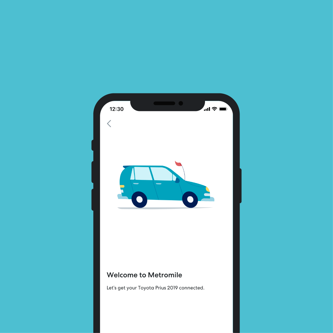
Illustrations
Before
busy look
low contrast & legibility issues
rare human depiction
After
clean modern look
high contrast & vibrancy
relatable & diverse human depiction
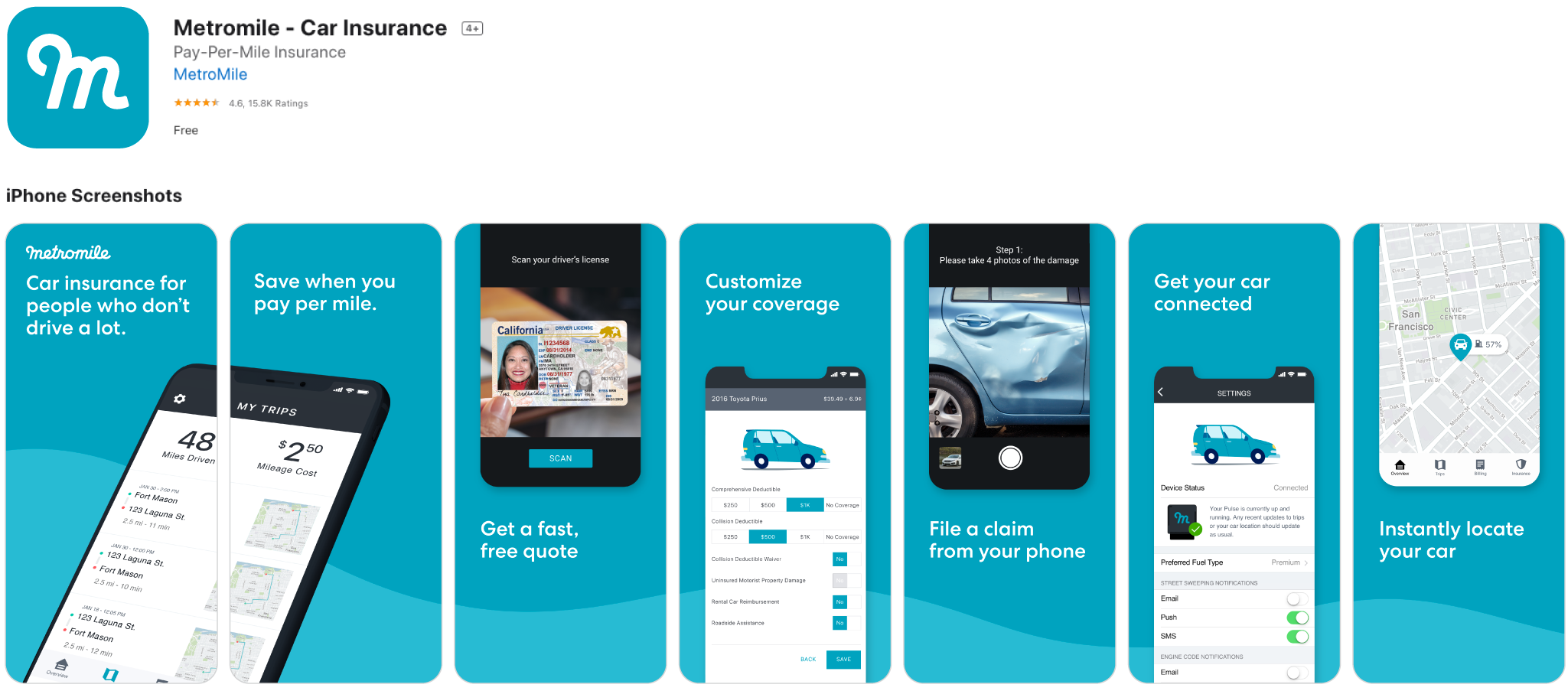
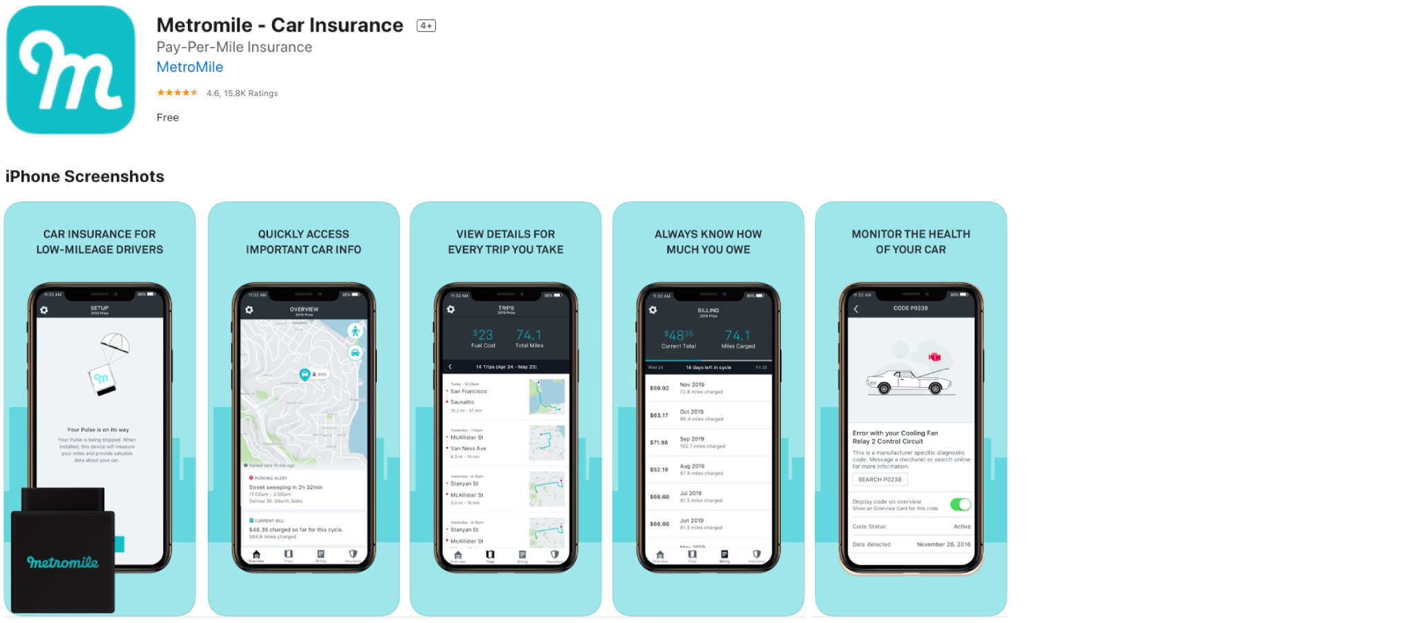
App Store
(click on image to see before & after)
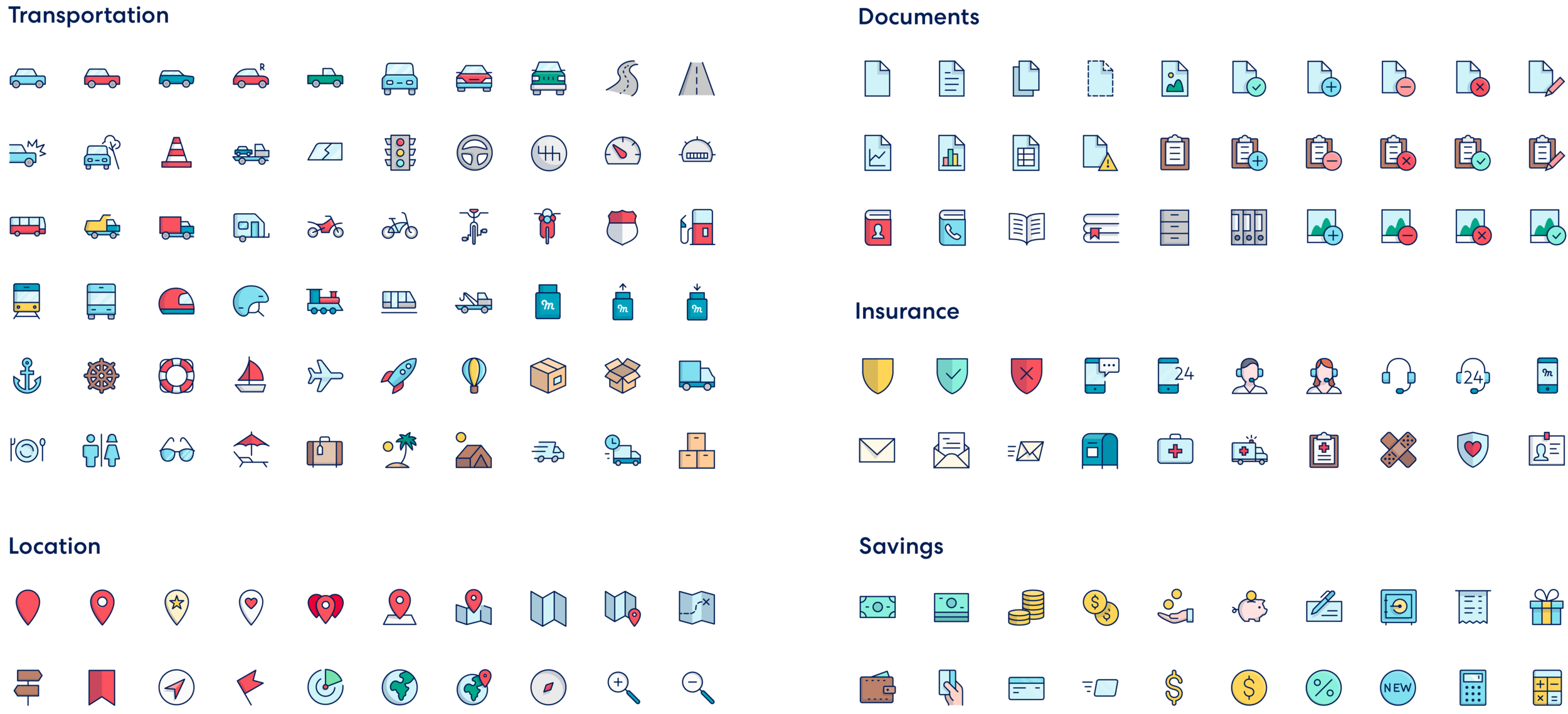
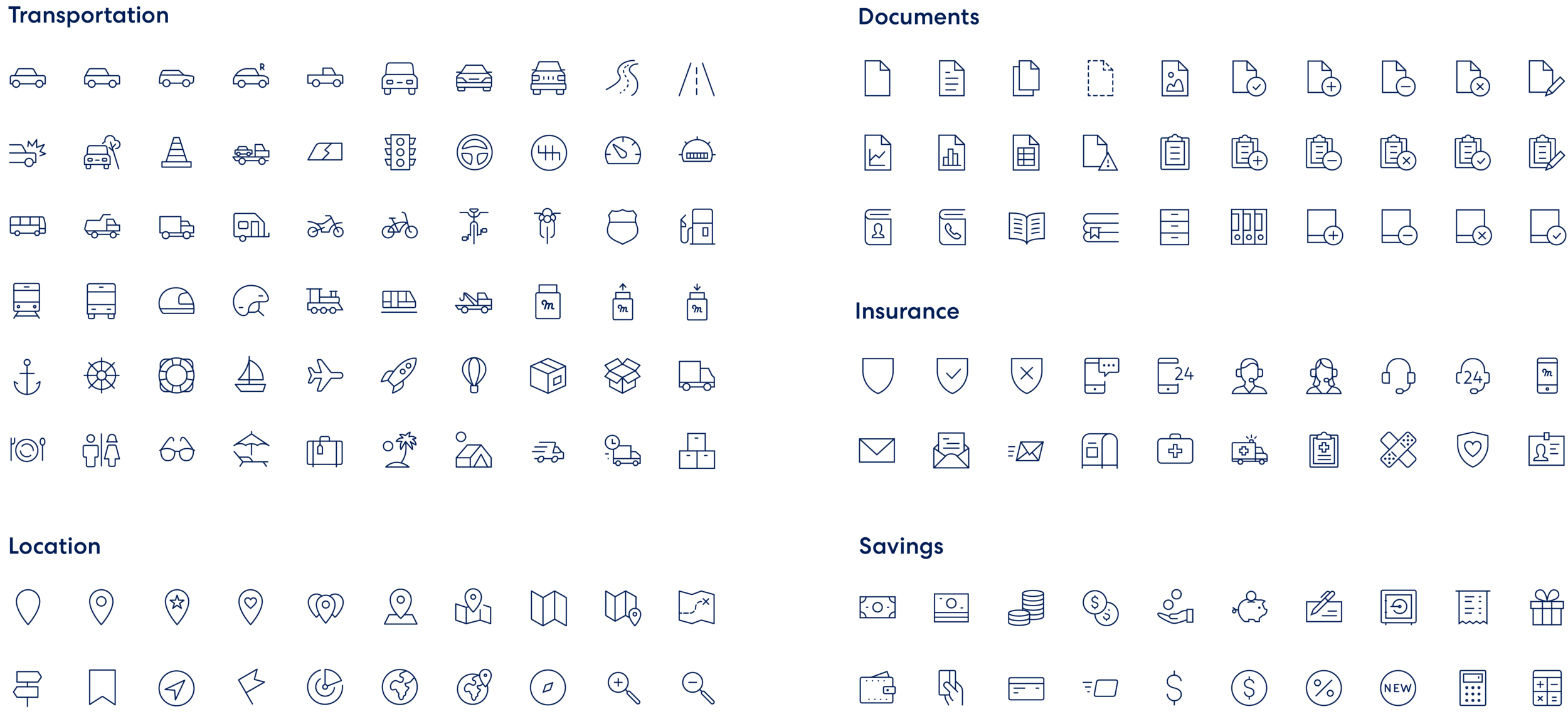
Icons Library